Does this (further) devalue the Starbucks brand?
I'm all over the map on my opinion of Starbucks as a brand. I don't trade there. Only if I'm in a place like Emporia, KS and am in dire need of a drink do I partake. Although when I'm in Japan, Starbucks is one of the only places I can get soy milk. And I don't have to use my Japanese to order. The point is, I go out of my way to frequent local coffee shops. Better beans, better service and rarely do I have to put up with something like this:
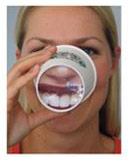
Via CC Chapman over at Crayon, this partnership between Wrigley and Starbucks places extremely creepy white teeth on the bottom of the cup. "Yay, I came up with a non-traditional advertising idea!" Reasons why I find this campaign difficult to swallow (I had to do it).
1) This is intrusive. It's bad enough that consumers (though some very willingly) pimp the Starbucks logo like beverage bling. I have a problem with brands asking consumers to both purchase and display. I mean, does anyone really want to have this on the bottom of his cup?
2) Horse teeth. Pretty white horse teeth, but horse teeth nonetheless.
3) What happens if someone rotates the cup? Are the baristas given a graphic cue on the cup to place the lid in the right spot? What happens after the customer hits the milk station?
4) I get the co-branding opportunity. Coffee stains. Gross teeth. Whitening gum. "We know you're going to keep drinking our coffee, so here's a way to chase the stain." But I'd love to have heard the discussion in the boardroom regarding calling attention to coffee's negative results.
5) Did I already say I don't like paying to be a brand's billboard?
6) Some friends and I argue over Starbucks current on-cup "The way I see it" quotes. I like them. Some people find them rather uppity. A graphic design purist friend hates the clutter. I'm sure she would say these cups are getting close to being NASCAR-like displays.
7) I worked with a coffee company once and we developed some ideas for bottom-cup messaging. It was all text-based and about the drink in hand. I think that works.
8) Why didn't Wrigley partner with Phillip Morris?
9) In that vein, what brand manager from a large teeth-staining winery would allow messaging on the cork?
Final vote? This afternoon I'm going, as always, to Broadway Cafe, which is right next door to the Westport Starbucks, for my joe jolt. They have plain white cups. And better coffee. Maybe I'll draw something on the bottom of the cup just to spite the campaign.
I wonder if Wrigley's could have spent nearly the same amount of money to send a stick of gum sampler to be included with each coffee purchase. That I could get behind. This looks too much like I'm drinking a Triple Grande Carmel Mr. Ed Skinny Capp.
Listening to - The Rentals, Return of the Rentals
Labels: Advertising, branding
posted by Andy Woolard at 2:41 PM
![]()
![]()


6 Comments:
I must admit I have some loyalty to Starbucks after working there for 2 years, but this is a bit creepy.
I get that, but is your loyalty to your former employer or the brand's attributes?
You know what I WOULD like to see...some bulk coffee sacks turned into bags. :)
love the quotes. not the horse teeth.
Don't give out my secrets. :)
The last thing I need is to be walking down the street, finishing off my coffee, and having to wonder why the kid and his mom on the corner are pointing and staring at me – only to realize that I'm being pimped as a personal billboard for Starbucks.
And yes, these kind of work in all the photos that I've seen of the campaign. But probably not so well in most cases where the teeth are sideways or upside down.
Oh, and have you seen the noses?
emporia has a really cool coffee shop in an old theater, on merchant street. just so you know.
Post a Comment
<< Home